This post contains affiliate links, so we may earn a commission from any purchases you make, at no cost to you.
As a graphic designer specializing in logo design for industrial brands, I had the exciting opportunity to revamp the logo for WEMPumps, a leading manufacturer of galvanized steel pumps under new ownership. This blog showcases our creative process, as we drew inspiration from the brand’s 1950s original logo, modernized it for contemporary appeal, and engaged in iterative design revisions with open communication. Join us as we delve into the meticulous crafting of every design element, featuring the design sheet guiding WEMPumps’ brand identity with consistent typography, light and dark logo versions, and a purposeful color palette.
As we embarked on revamping WEMPumps’ logo, we understood the importance of staying true to the brand’s industrial heritage. Analyzing the original 1950s logo, we identified its core elements, shapes, typography, and color scheme, to draw inspiration for our modernization process. Our goal was to create a contemporary logo that honors the brand’s legacy while resonating with the industrial sector’s demands.
To make WEMPumps’ logo relevant in today’s competitive market, we focused on simplifying the design. By streamlining the logo’s elements and refining the typography, we achieved a clean and industrial aesthetic that reflects the brand’s commitment to precision and efficiency. The updated logo now stands as a symbol of reliability and trustworthiness for potential customers in the industry.

Throughout the logo design process, open communication with WEMPumps’ team played a pivotal role. Presenting multiple design iterations, we sought valuable feedback to align our vision with their expectations. Collaboratively, we refined the logo until it epitomized the blend of heritage and modernity they envisioned. This iterative approach ensured the final design resonated with the brand’s values and resonates with their target audience.
Crafting each letter with precision was crucial to create a logo that symbolizes WEMPumps’ industrial excellence. We focused on geometry, symmetry, and legibility, evoking a sense of stability and strength essential to an industrial brand. Additionally, we curated a purposeful color palette that symbolizes strength, durability, and innovation, reinforcing WEMPumps’ position as an industry leader.
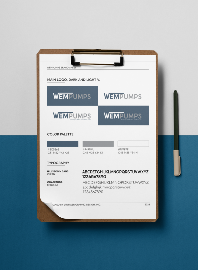
To maintain brand consistency across all platforms, we created a design sheet that guides WEMPumps’ logo usage and visual assets. The design sheet provides instructions for typography choices in different contexts, offers both light and dark versions of the logo for visibility on various backgrounds, and incorporates a brand color palette that embodies industrial values. This guide empowers WEMPumps to establish a unified and professional image, instilling trust among customers and partners.

Our partnership with WEMPumps exemplifies the power of creative discovery and collaboration in logo design for industry brands. By drawing inspiration from their original logo, engaging in iterative design revisions with consistent communication, and meticulously crafting every design element, we successfully elevated their brand identity. The design sheet ensures WEMPumps maintains a strong and consistent visual presence in the competitive industrial market. As a logo designer specializing in industry brands, we are proud to be part of this transformative process and are eager to see WEMPumps thrive under its new ownership with a logo that stands the test of time.
Thanks for reading this blog! Click the following links if you want to contact me or see more of what I do as a designer.
Keep an eye out for a future blog where we unveil WEMPumps’s new website and showcase the amazing before and after.


